Figwee Visual Food Diary
- 3.2
- Rating
- 10.00K
- Installs
- Free
- Price

 Analysis by App-foxy
I found Figwee Visual Food Diary most interesting when I stopped treating it like a traditional calorie database and used it as a quick visual record of what I had actually eaten. That difference matters. Instead of making every entry feel like a search exercise, the app is built around recognizing food visually and estimating portions in a more immediate way. For people who find conventional calorie counters tiring, that can make food logging feel less like paperwork.
My overall impression is mixed but useful: this is a focused food and drink app with a clear idea behind it, yet the visual approach will not suit everyone. It is free to install, with optional in-app purchases ranging from around four dollars to around eight dollars per item, and it comes from Bellwether Ideas LLC. Its average rating sits at 3.2 from roughly eighty ratings, while the app has passed ten thousand installs. Those numbers suggest a small, unevenly received product rather than a universally polished favorite, and my experience supports that cautious reading.
The strongest reason to try it is convenience. The strongest reason to hesitate is that visual estimation can feel too approximate when you need careful nutritional control. I would recommend testing it during ordinary meals before relying on it for a strict diet plan, medical nutrition routine, or highly precise tracking goal.
You May Also Like

 AccuWeather: Weather Radar
AccuWeather Review: A Quick, Clear Forecast for Everyday Decisions
For everyday plans, the best forecast is the one you can understand quickly. AccuWeather makes rain timing, radar, and local conditions easy to act on, with a few trade-offs.

 Hill Climb Racing
Why Hill Climb Racing Still Turns Crashes Into One More Run
A tiny car, a bumpy hill and one more upgrade: Hill Climb Racing keeps resurfacing because its simple chaos makes every near-miss feel personal.

 AliExpress - Shopping App
AliExpress Makes Global Shopping Feel Personal, but Shoppers Bear the Risk
AliExpress turns a global marketplace into a pocket-sized discovery engine. Its reach is useful, its shopping loop compelling, and its trade-offs easy to miss.

 Lords Mobile: Kingdom Wars
Lords Mobile Is a Kingdom-Building Routine, Not a Quick Match
A case-by-case verdict on the building, battles, device demands, and social commitments that make Lords Mobile rewarding for some players and exhausting for others.

 PDF Scanner app - TapScanner
TapScanner Makes Paperwork Easier to Capture, Check, and Share
TapScanner makes scanning with a phone feel less like a rescue operation and more like a dependable step in getting work done. Its capture tools are useful, though not flawless.

 Block Blast!
 Shows How Much a Puzzle Game Can Leave Out
A quiet grid game shows why puzzle players increasingly value instant clarity, repeatable skill and low-pressure play—and where the genre still needs to catch up.
More From Our News Desk
View All News


How clearly the visual diary communicates information
When I judge how clearly a visual food diary communicates, I look beyond whether an image is easy to recognize: I also ask whether it helps me make a sensible choice without implying more certainty than it can provide. That distinction matters most with meals whose ingredients are not obvious. Next, I consider how the same visual-first approach feels for people with different motor, sensory, and cognitive needs.
Recognition is faster than building every meal from a database
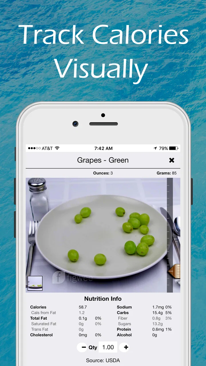
The central idea is easy to understand: food is represented visually so I can think in terms of what is on my plate rather than only searching through long ingredient lists. That makes the first few seconds of logging less intimidating. When I am recording a familiar meal, a visual reference can help me make a reasonable choice without remembering the exact name of a database entry.
This approach is particularly helpful for someone who does not naturally think in grams, serving sizes, or recipe components. A plate of pasta, a sandwich, or a snack can be easier to identify from an image than from a technical description. The app’s visual diary also encourages a more concrete habit: I am documenting the meal I saw and ate, not trying to reconstruct a perfect nutritional report after the fact.
That simplicity has a trade-off. A picture can communicate the general shape and portion of food, but it cannot automatically explain every ingredient, cooking method, sauce, topping, or hidden calorie. A visually similar meal may have a very different nutritional profile depending on preparation. I therefore treat the app’s result as an estimate and a prompt for awareness, not as a laboratory measurement.
Readability depends on how comfortable you are with visual cues
For many users, image-led choices may be easier to scan than dense text. Someone who finds long lists difficult to follow may appreciate being able to compare food visually and move forward with less reading. This is also useful when I am tired or distracted and want to record a meal before forgetting it.
However, a visual-first design can create problems for people who need strong text support, high contrast, predictable labels, or very explicit descriptions. Images are not automatically accessible simply because they are simple. If I cannot distinguish similar foods easily, or if I need precise written context before making a selection, the app’s main strength becomes a source of uncertainty.
I would approach the interface with a short trial rather than assuming it will work for everyone. Try logging breakfast, a mixed lunch, and a packaged snack. Notice whether the choices are understandable without repeatedly guessing. If the visual categories make sense quickly, the app may reduce friction. If I am constantly opening alternatives to work out what an image represents, a text-heavy calorie counter may be more comfortable.
Navigation works best when the meal is uncomplicated
The diary concept feels most natural when I am recording one meal at a time and want a quick overview of the day. A simple breakfast or a recognizable snack is a good test because there are fewer decisions. The experience becomes more demanding when a meal includes several ingredients or when I need to separate a recipe into individual components.
This is an important distinction for people with different cognitive and attention needs. A short visual decision can be easier than typing, but too many similar choices can also create decision fatigue. I found that the app makes more sense as a lightweight daily check-in than as a detailed nutrition accounting system. The more precision I expect, the more time I need to verify that the selected food actually matches what I ate.
One practical workflow is to use it immediately after eating rather than at the end of the day. That keeps the visual memory fresh and reduces the need to remember portions later. It also limits the number of meals waiting to be entered, which makes the diary feel less like a backlog. This small habit is more important here than it would be in a conventional tracker because the app depends on recognizing the meal in context.
What the current release means for expectations
The app is currently at version 4.7 and supports devices running Android 6.0 or later. That makes it available to people using older Android hardware, which is helpful in situations where replacing a phone is not realistic. It is also rated for Everyone, so its intended audience is broad rather than restricted to a particular age group.
Those details do not guarantee that every screen will feel equally comfortable on every device. Older phones can differ in display size, brightness, responsiveness, and text rendering. If I am using a smaller screen or an older handset, visual food comparisons may require more attention than they would on a newer, larger display. That is not necessarily a flaw in the concept, but it is worth considering before making the app part of a daily routine.
Motor, sensory, and cognitive considerations in everyday use
I find that reducing typing can make a quick food record more manageable, but the effort does not disappear; it shifts toward tapping, comparing images, and deciding whether a portion looks close enough. I would pay attention to how those small tasks feel when tired or distracted, not only during a calm first try. That leads to a broader question: whether the app remains usable amid the interruptions and constraints of ordinary life.
Less typing can help, but selection still requires control
The visual diary has a natural advantage for people who find repeated typing uncomfortable or slow. Choosing from visual food options can reduce the number of keystrokes and may be easier than entering custom descriptions for every meal. For someone managing hand fatigue, limited dexterity, or a busy routine, that reduction can make the difference between logging consistently and abandoning the habit.
At the same time, less typing does not mean no interaction effort. I still need to identify the right visual choice, move through the available options, and decide whether the portion shown resembles my own. If tapping small targets or making repeated selections is difficult, a visual interface may not remove enough physical effort to solve the problem.
I would use the app in short sessions instead of trying to enter an entire week at once. That reduces repeated movement and gives me a chance to stop if the process becomes tiring. It also fits the product better: a visual diary is most useful when it captures meals close to the moment, not when I am trying to reconstruct everything in one long sitting.
Visual sensitivity can change the experience completely
Images are central to this app, so people who are sensitive to busy visuals, color differences, glare, or crowded screens should pay attention to how the interface feels in real conditions. A bright kitchen, a dim bedroom, or an outdoor lunch can produce very different results from testing the app in a quiet room.
For me, the most comfortable use case is a quick check on a reasonably bright screen with enough time to compare choices. When I am rushing, the visual method becomes less reliable because I am more likely to select the first plausible option. That is a useful reminder that accessibility is situational: an interface can feel clear when I am rested and confusing when I am hungry, hurried, or distracted.
People who rely heavily on spoken feedback, screen magnification, or nonvisual navigation should test the app directly with their usual setup before depending on it. I would not assume that a food image communicates enough on its own. The app’s core value comes from seeing the food, so anyone who cannot comfortably use that visual information may get more dependable results from a tracker organized around searchable text and explicit nutritional fields.
Memory support is one of the quieter benefits
A visual record can support users who struggle to remember meals across a busy day. Instead of recalling a technical food name, I can use the diary as a visual reminder of what I logged. This may be useful for people who are building awareness gradually and do not want to start with detailed nutrient analysis.
There is a subtle trade-off here. A visual diary may help me remember the existence of a meal, but it does not automatically solve uncertainty about ingredients or portion size. For example, remembering that I had a bowl of soup is easier than remembering how much oil, cream, bread, or cheese accompanied it. The app can support recall, but I still need to make sensible judgments when the meal is mixed or homemade.
My best tip is to use the diary to identify patterns rather than chase perfect individual entries. After several days, I can look for practical questions: Do I skip breakfast when mornings are rushed? Do I underestimate snacks? Are my portions larger when I eat while working? Those insights can be valuable even when each calorie estimate is not exact.
Who benefits most from this interaction style
I see the app working best for people who want a low-pressure introduction to calorie awareness, prefer visual choices to long searches, or need a quick way to record familiar meals. It can also suit someone who has tried detailed trackers and quit because entering every ingredient felt like too much work.
It is less suitable for users who need exact recipe calculations, detailed macronutrient accounting, barcode-centered shopping workflows, or extensive written explanations for each food. A conventional calorie counter with a large searchable database may be better when precision and customization matter more than speed.
Access in real situations rather than ideal ones
I think the best test is not a perfectly quiet trial but a real meal: a rushed lunch, an unfamiliar dish, or a shared table where serving sizes vary. Those situations reveal when a visual estimate is a helpful approximation and when I need more detail than a picture-based choice can offer. They also make it easier to see which barriers are occasional inconveniences and which could undermine regular use.
A realistic lunch-break scenario
Imagine I am eating lunch at work with only a few minutes available. I have a sandwich, fruit, and a drink, and I want to record the meal before returning to my tasks. A visual diary can be useful here because I can think in recognizable food categories instead of typing a detailed description. The process supports a quick estimate and lets me keep moving.
Now change the situation: the sandwich comes from a café, the filling is unfamiliar, and the portion is larger than the examples I am comparing. The same visual convenience becomes less certain. I may record something close enough for general awareness, but I should not interpret that entry as exact. This is where I would rather have a detailed database or the ability to enter ingredients manually.
The lesson is not that the app fails with restaurant food. It is that the quality of the result depends on how closely the visual reference matches the meal. Familiar, visually distinct foods are easier. Mixed, customized, or heavily prepared foods require more caution.
Travel, shared meals, and changing routines
Travel is another situation where a quick diary can be appealing. When meals happen at irregular times, a lightweight visual record may be easier to maintain than a detailed nutrition spreadsheet. It can help me preserve the habit even when I do not know every ingredient.
Shared meals create a different challenge. If several people serve themselves from the same dishes, portion estimates become personal and variable. The app may still help me record the general meal, but I should avoid comparing my entry too literally with someone else’s. The visual method works best as a personal consistency tool, not as a precise measuring instrument for a whole table.
For people with fluctuating energy, the ability to record something quickly may be more realistic than waiting until they have the time or concentration to enter every detail. I would keep expectations modest: capturing a useful approximation is better than abandoning the diary entirely, provided I understand what the approximation can and cannot tell me.
Cost and commitment affect inclusive access
The app is free to download, which lowers the barrier to trying its basic approach. Optional purchases cost from around four dollars to around eight dollars per item. For some users, that may be manageable; for others, any paid expansion can make the experience less practical, especially if they are comparing several nutrition tools.
I would not pay immediately. First, I would check whether the free experience supports the meals I commonly eat and whether the visual method feels comfortable with my device and abilities. If it does not work at that stage, purchasing additional content is unlikely to fix a basic mismatch between the interaction style and my needs.
This trial-first approach is also useful for caregivers or families deciding whether the app is suitable for someone else. The Everyone rating makes the audience broad, but age suitability is not the same as usability. A child, older adult, or person with visual or motor limitations may need a different amount of support even when the content itself is appropriate.
Where barriers remain
I would separate limits that come from the visual method itself from obstacles that depend on a person’s device, abilities, or food routine. A familiar snack may be straightforward, while a mixed recipe can demand guesses about ingredients and portions; a quick interface also still relies on seeing and selecting the right option. With that in mind, I turn to the barriers that may make another tracking approach a better fit.
Approximation can become a problem when precision matters
The biggest limitation is built into the concept. Visual comparison is fast because it simplifies the decision, but simplification can hide meaningful nutritional differences. Two meals may look alike while differing because of ingredients, preparation, or serving size. If I am following a clinician-directed calorie target or managing a condition where food details matter, I would use a more exact tool or verify entries independently.
This does not make the app useless. It changes the job I expect it to do. I see it as a habit-building and awareness tool, especially for noticing meal patterns. I would not use it as the only source for medical decisions or as proof that a meal falls within a narrow nutritional limit.
Mixed dishes demand extra attention
Simple foods are easier to recognize than recipes made from many parts. A plain fruit or a familiar snack presents fewer questions than a casserole, curry, salad with dressing, or homemade sandwich. In these cases, I need to think about what is hidden beneath the visual surface.
A helpful workaround is to record the meal in the closest honest category and make a mental note when uncertainty is high. That prevents false confidence. If the same complicated meal appears often, I would consider whether a database with recipe-building tools would save time in the long run. Repeated uncertainty is a sign that this app may not be the right primary tracker for me.
Ratings suggest a product worth testing personally
The average rating of 3.2, based on roughly eighty ratings and about twenty-five written reviews, gives me a reason to keep expectations realistic. It is not evidence that the concept is poor, but it does suggest that the experience may not satisfy every user. With more than ten thousand installs, it has found an audience, yet it remains a relatively small app compared with the most familiar calorie-tracking services.
I interpret that combination as a reason to judge it by workflow rather than popularity. If visual food selection genuinely reduces my effort, the app can be valuable even without a high public rating. If I need a mature ecosystem, extensive customization, or highly detailed nutrition records, the smaller scale may become a disadvantage.
When another kind of app is the better choice
I would choose a conventional calorie counter when I need searchable text, barcode-style product identification, recipe construction, or detailed nutrient breakdowns. Those tools are usually better suited to people who enjoy precision and are willing to spend more time entering information.
I would choose a simple notes app or photo diary when my only goal is remembering what I ate without estimating calories. That option may be less structured, but it can be more comfortable for someone who finds calorie numbers stressful or unnecessary.
I would choose Figwee when the main obstacle is starting and maintaining a visual food record. Its value is greatest when a quick, approximate entry is more useful than a perfect entry that never gets made. The right choice depends on whether consistency or precision is the problem I am trying to solve.
My inclusive verdict after using the visual approach
I appreciate the app’s attempt to make calorie tracking less dependent on typing and technical food vocabulary. The visual diary can lower the mental load of recording familiar meals, support memory during busy days, and give beginners a less intimidating way to notice eating patterns. It is also free to try, works on Android versions from 6.0 onward, and is intended for Everyone, which makes experimentation relatively straightforward.
Its inclusive potential has limits, though. A visual interface is not automatically comfortable for people with low vision, sensory sensitivities, or a strong need for text-based navigation. Reduced typing may help users with hand fatigue, but selecting among similar images can still require effort. People with cognitive or attention differences may enjoy the short visual choices, while others may find ambiguous food images more demanding than explicit labels.
My recommendation is to test the app during three different kinds of meals: a simple familiar snack, a mixed homemade dish, and a meal eaten under time pressure. That small trial reveals more than a store description can. If the first experience feels quick and understandable, use it for pattern recognition and everyday consistency. If you spend most of your time questioning the images or correcting estimates, move to a text-based tracker instead.
For me, Figwee is a useful niche option rather than a complete replacement for every calorie counter. Bellwether Ideas LLC has built an approachable idea around visual food logging, and the current version gives that idea a practical form. I would recommend it to a friend who wants a gentler starting point and accepts estimates. I would steer away from it for anyone who needs rigorous nutritional accuracy, extensive written detail, or an interface that can be used comfortably without relying on visual food recognition.
FAQs for Figwee Visual Food Diary
01What is Figwee Visual Food Diary used for?
Figwee Visual Food Diary is designed to help you record what you eat through photos and visual food portions rather than relying only on written descriptions. It can make meal tracking quicker and more intuitive, while also helping you review eating patterns over time. The app is especially useful for people who prefer a simple visual diary instead of detailed calorie-counting tools.
02Does Figwee Visual Food Diary count calories and provide nutrition information?
Figwee focuses primarily on visual meal logging and portion awareness, so it should not necessarily be treated as a complete replacement for a professional nutrition tracker. Depending on the food and information you enter, it may help you estimate portions or review meals, but nutritional values can vary considerably. Users with strict dietary, medical, or weight-management requirements should verify information independently.
03Is Figwee Visual Food Diary suitable for tracking specific diets or allergies?
The app may be helpful for keeping a visual record of meals when following a particular eating routine, such as reducing snacks or monitoring meal consistency. However, it is not a medical allergy-management system and may not identify every ingredient hidden in prepared foods. Anyone with serious allergies, diabetes, or another health condition should use the diary only as a supporting tool and confirm ingredients carefully.
04Is Figwee Visual Food Diary easy to use for beginners?
The visual approach makes Figwee relatively approachable for beginners who find traditional food journals tedious. Instead of entering lengthy descriptions for every meal, users can create a record that is easier to understand at a glance. There may still be a short adjustment period while learning the available food categories and deciding how accurately to represent homemade dishes, restaurant meals, and unusual portions.
05Does Figwee Visual Food Diary require an internet connection or account?
Requirements can depend on the current version of the app and the platform being used. Some diary functions may work locally, while downloading visual content, synchronizing data, or using optional online features could require an internet connection. Before relying on the app for long-term records, review its permissions, privacy policy, and account requirements, particularly if your food diary contains sensitive personal or health-related information.
Pros
- Visual portions make food logging quick and easy.
- Useful reference images help estimate serving sizes.
- Supports mindful eating without requiring calorie counting.
- Simple diary format makes daily entries easy to review.
- Helpful for users learning what balanced portions look like.
Cons
- Food database coverage may be limited for regional dishes.
- Portion estimates can still vary significantly between users.
- Some advanced features may require a subscription.
- Manual logging can become repetitive over time.
- Not a replacement for professional dietary advice.

Figwee Visual Food Diary
Gallery